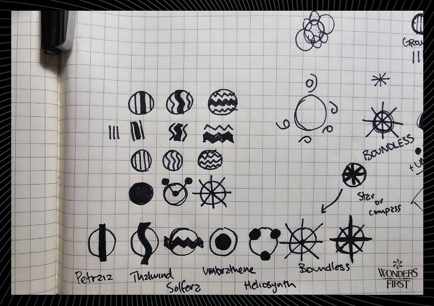
The Objective: Create a set of timeless icons that people would want to wear when they start to form an affinity with the Orbitals….perhaps even get as a tattoo.
Sounds easy, right?
As it turns out, creating an iconic icon is really difficult, let along designing an entire, cohesive set of them. The Orbitals are our realms and serves as the basis for how our characters our are defined and where they exist. Our design process for the Orbital icons spanned several months as we ran into several challenges while concepting and sketching ideas.
There are several key things to keep in mind while creating an icon or icon system:
1.The icons must work at all sizes. Remember, these have to show up on a trading card, meaning they will likely be printed very small. At the same time, icons can be used as branding assets, and must be able to scale from a trading card up to a billboard. This often means stripping all complexity away and working with very simple form factors.

2. The icon must convey its meaning quickly. You should be able to glance at an icon and grasp what it’s trying to tell you fairly quickly. If it’s difficult to parse a meaning to an icon, your audience will be spending precious brain resource to constantly connect the knowledge gap – resources that are better used for game strategy decisions.

3. If you’re designing an icon system, it must be cohesive. One of the biggest challenges we faced for the Orbital icons was how to keep a consistent theme between all of them. We wanted them to leverage of our existing visual system while leaving no doubt that they all belong together. You can see in the sketches our attempts at resolving this a number of different ways.
There are many other considerations, but this is a good start for understanding the basics. You can see how we worked through many of these considerations in the sketch iterations below.


There were a number of challenges we faced. We wanted to create something meaningful and clean while making them clearly tied to an Orbital, even if you have just the most basic understanding of the Orbitals. We also didn’t want to reach for the “low hanging fruit” or copy any existing TCGs out there. Meaning, a skull for Umbrathene or a water droplet for Thalwind were too easy of choices and had been done before. Lastly, we had to make the icons feel like part of the Wonders universe in a cohesive way.
In the end, we hit a burst of inspiration starting with the Boundless icon, integrating the small circle as a consistent way to represent the Orbital itself, and then building from there. The arcs became a secondary feature to give each icon a feeling of place – even removing it from the Boundless icon was meaningful, as it exists outside of space and time as we understand it.
Inspired by the Orbital themes below, you can begin to see how each icon begins to integrate the concepts with simple shapes, while keeping the consistent circles and arcs throughout.
- Petraia (Green): Wilderness and growth.
Inspired by roots, connectedness, and abundance. - Solfera (Red): Earth, fire, war, and wealth.
Inspired by: heat, flame, and mountain ranges. - Thalwind (Blue): Sea, exploration, and weather.
Inspired by: duality, wind and sea currents, and the eye of the storm/whirlpool. - Heliosynth (Yellow): Technology and knowledge.
Inspired by: gears, resourcefulness, and the rising sun. - Umbrathene (Purple): Darkness and void.
Inspired by: shade and the lunar eclipse. - Boundless (White): Divinity, justice, and the cosmos.
Inspired by: stars and existing outside the boundaries.
See below for how each Orbital icon came out, as well as the full Wonders of The First icon set as it currently exists. We absolutely love the final collection and think they hit the mark with all the considerations laid out above. Which one is your favorite?


